
GE Analytic Tool's Tutorial — Revamp from pptx. to an Interactive Site
Helping GE transform their strategic pivot from a plain Powerpoint to a seamless onboarding, which included a design director, a PM, three engineers, and a UX writer, while keeping the GE team aligned with our strategy.
Role
Product Designer
Industry
Power and Renewable Energy
Duration
Oct 23' — Mar 24' (5 months)
Core Responsibilities
Main designer in team of 2, product strategy, research and mapping, IXD, visual design, illustrations/icons, prototyping, QA assist

Problems &
Insights
Professionals and staffs of the energy sectors are struggled to comprehend the PowerPoint technical guides, leading frustration and long learning curve.
Vague, complex and non-interactive graphs
Causes desensitization and affects motivation to learn
Being confused impacts abilities of using the tools correctly
Due to long learning curve and overlooking details.

Goals &
Planning
Refocusing Onboarding:
From rambling graph files to an interactive tutorial
Challenging this, we redirected the design towards a concentrated emphasis on facilitating a clear onboarding experience.
Guided by user feedback, I organized a three key strategies that streamlined features, amplified actionable items, consolidated our methods, and facilitated user adaptation to the redefined site, concurrently uplifting user engagement and team spirit.
Use annotated patterns to introduce features
This will draw attention to specific features in the product with subtle cues, notes, or highlights.

Use welcoming and simple tone: keep it clear and tidy
Several key items include: clear header and sub-header, stand out call-to-actions, and a complete step by step walk through.
Include a progress indicator to avoid frustration
An easy-to-use stepped process helps users avoid frustration and successfully complete this complex technical tutorial.

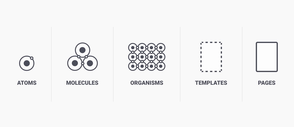
Leverage the "atomic design system"
By creating systems of components, we are able to create more flexibility in design and scale them accordingly depending on the content.
Design
Process
Mapping the route:
How do we walk the users through the data and tools?
Achieving this, we quickly mapped out the approximate route and track the eye movements of jumping back and forth from the side bar to the screen.
Add a "How to Use" Section
There are four feature actionable sections to help users to go through the tutorial.

Make sure the route is clear: showing 1 card at a time
A single screen can have as many as 5 features that needs to be highlighted. To make it easier for user to comprehend, we decided to only show one card at the time.

Maintain the readability: in case of smaller graphs and copy
To maintain a good readability and clarity, the screen size will increase and side bar will be hidden temporarily to show the copy and data.

Results
Demonstrating the design:
What are the key outcomes?
Floating reset & timeline tab enable users to switch between screens seamlessly at any time

The progress indicator help setting users expectation and keep them informed in the process

The summary card at the beginning of each screen tells users the big picture and what to expect in the section

Prototyping
Testing the prototype:
Helping us validate and adjust the designs with potential users and presenting the results across teams

Reflections &
Feedback
Culminated in a 30+% increase in user engagement in first week and a 20+% jump in sale conversions about the tool
Achievements
The product is highly complimented by both GE team and professionals, receiving over 30 positive reviews on Slack
By implementing our atomic design system, we managed to produce over five tutorials for other energy and performance related tools.
See More